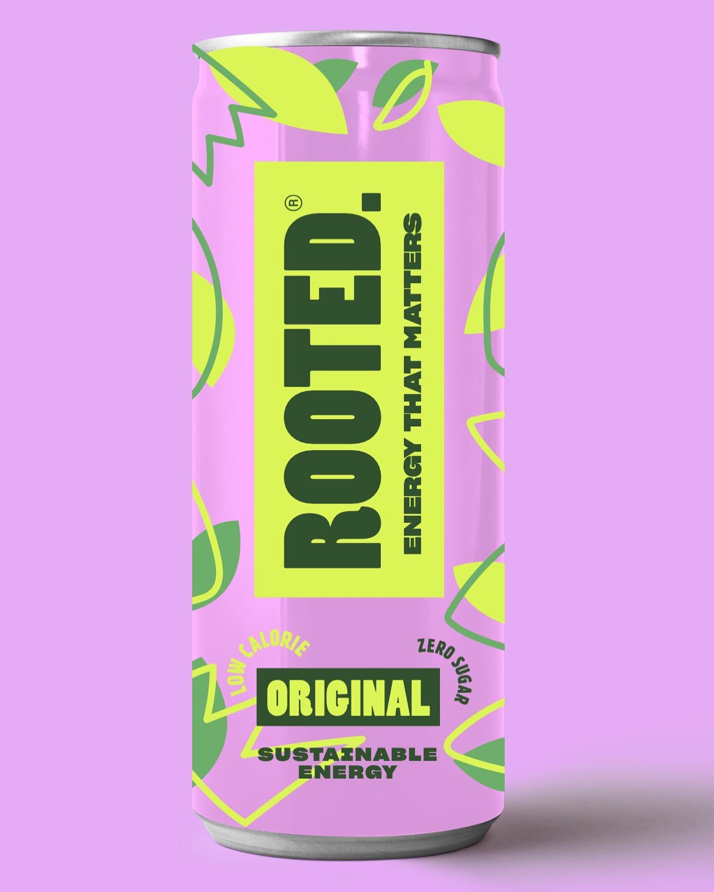
As a freelance graphic designer - I always get asked by clients - what does vector - or bleed mean etc?…Lot’s of graphic design terms can be quite hard to understand, so I thought I would comprise, and share a list of graphic design terms and phrases to help out non-graphic designers, and clients. Here is a list of 30 common graphic design terms.
Typography
Typography in graphic design is the art of arranging type (fonts) to make written text legible, readable, and appealing when displayed. It involves graphic designers selecting typefaces (fonts), point sizes, line lengths, line-spacing, and letter-spacing to create a visual hierarchy. Typography plays a crucial role in defining the visual identity of a brand or any piece of communication.
Kerning
Kerning is a fundamental aspect of typography that refers to the adjustment of space between pairs of letters or characters to create visually appealing and balanced typography. It involves the graphic designer fine-tuning the spacing between specific characters to ensure that the overall text looks well-proportioned and readable.
Leading
In graphic design, leading refers to the vertical space between lines of text. It plays a crucial role in determining the readability and overall visual appeal of a design. Proper leading ensures that text is easy to read and comprehend, preventing it from appearing too cramped or spread out. Designers often adjust leading based on the typeface, font size, and overall layout of a project. By finding the right balance between text and space, they can create harmonious designs that effectively convey the intended message.
X Height
In typography, the term "x-height" refers to the height of a lowercase "x" in a particular typeface. It is a crucial measurement as it determines the overall legibility and readability of the text. A larger x-height often results in better readability, especially in small font sizes or for lengthy passages of text. Graphic designers and typographers carefully consider the x-height when selecting a typeface for a specific project to ensure optimal readability and visual appeal.
Sans Serif
Sans serif is a type of font that does not have the small projecting features called "serifs" at the end of strokes. These fonts are characterised by their clean and simple appearance, making them easy to read on digital screens. Sans serif fonts are commonly used for headings, digital content, and materials intended for online viewing due to their contemporary and simple design.
Serif
Serif is a style of font that is characterised by small decorative strokes or lines added to the end of the main strokes that make up the letters and symbols. These extra embellishments give serif typefaces a more traditional and formal appearance compared to sans-serif fonts, which lack these decorative elements. Serif fonts are often used in print media, books, and formal documents due to their readability and classic look.
Orphans and Widows
Orphans and widows are typographic terms that refer to single lines of text at the beginning or end of a paragraph that are left dangling at the top or bottom of a page, separated from the rest of the paragraph. An orphan is a single word, part of a word, or very short line that appears alone at the bottom of a paragraph, while a widow is a single word or short line that appears alone at the top of a column or page.
RGB
RGB stands for Red, Green, Blue, which are the primary colours used in digital and web design to create a wide array of colours by blending different variations of each colour channel. In the RGB colour model, colours are created by mixing these three primary colours of light in various combinations.
CMYK
CMYK stands for Cyan, Magenta, Yellow, and Key (black). It is a print colour model used in colour printing. These four colours are combined in varying percentages to create a wide range of colours in printed materials such as brochures and packaging etc.
Pantone
Pantone is a standardised colour matching system used across various industries, predominantly in printing and graphic design. It assigns a unique colour reference code to each colour, making it easier for designers, printers, and manufacturers to ensure colour consistency across different printed materials and branded products.
Vector
A vector is a fundamental graphic design term that represents a two-dimensional graphic element defined by points, lines, curves, and shapes based on mathematical equations. Vectors are created using design software such as Adobe Illustrator, and they are scalable without losing quality, making them ideal for logos, illustrations, and other graphics that require resizing.
Raster
Raster is a term commonly used in digital imagery. It refers to a grid of individual pixels that collectively form an image. Each pixel contains specific colour information, and when combined, they create the overall visual representation. Unlike vector graphics which are based on mathematical equations, raster images are resolution-dependent, meaning their quality is determined by the number of pixels per inch.
Body Copy
Body copy, in the realm of graphic design and advertising, refers to the main text of a written communication. It is the core content that conveys information, tells a story, or delivers a message to the audience. Typically found in brochures, websites, advertisements, packaging and any other marketing materials, body copy plays a crucial role in engaging and informing the reader.
Hierarchy
Hierarchy in design refers to the arrangement or presentation of elements in a way that signifies their importance or creates a visual flow for the viewer. This principle helps guide the viewer's attention through a piece of design by establishing a clear order of significance among various elements.
White Space
In graphic design, white space refers to the area in a design that is left untouched by any elements such as text, images, or illustrations. It is sometimes also referred to as negative space. Despite its name, white space does not necessarily have to be white; it can be any colour, pattern, or background.
Mock-up
A mockup is a visual representation or a draft version of a design. It is typically used in the design and prototyping process to give a sneak peek into how the final product will look. Mockups can range from simple sketches to high-fidelity renders, depending on the stage of the project. Graphic designers use mockups to visualise the layout, functionality, and overall aesthetics of the end product before finalising the design. This helps in gathering feedback, making necessary revisions, and ensuring that the final product meets the desired expectations.
Golden Ratio
In graphic design, the Golden Ratio is believed to create aesthetically pleasing compositions. It is said to provide a sense of balance, harmony, and proportion that is visually appealing to the human eye. Many famous artists and architects, such as Leonardo da Vinci have incorporated the Golden Ratio into their works to create captivating and timeless pieces.
Cutter-Guide
A cutter-guide is a visual representation that indicates where a design should be cut. It is typically a separate file or part of the design file that shows the specific measurements and dimensions for trimming the final product to its intended size and shape. Cutter guides are essential part of packaging design, and printing process to ensure accuracy and precision when cutting materials such as paper. Graphic designers use cutter guides to communicate their intended cutting areas to printers so that the final product matches the design layout.
Lorem Ipsum
Lorem Ipsum is a placeholder text commonly used in the graphic design industry. It consists of scrambled Latin words, serving as a temporary filler to demonstrate the visual presentation of a document without being distracted by the actual content. Graphic designers often use lorem ipsum to showcase the layout, font choices, and overall design of a project before the final content is available. This standardised dummy text allows the focus to remain on the design aspects rather than the final text itself.
Bleed
Bleed serves a crucial role in ensuring that a final printed design looks polished and professional.
Bleed refers to the technique where the design extends beyond the edge of the final printed page, or packaging design. This extra space ensures that when the final design is trimmed, any slight discrepancies in the printing or cutting process do not result in unattractive white borders along the edges of the finished printed product.Brand Identity
Brand identity is the visible elements of a brand that distinguish and identify the brand in the minds of consumers. It is a reflection of the brand's personality, values, and mission, communicated through elements such as logos, colours, typography, imagery, and messaging.
Resolution
Resolution defines the quantity of detail an image holds. It is commonly expressed in pixels per inch (PPI) or dots per inch (DPI), indicating the number of pixels or dots within each inch of the image. A higher resolution results in a crisper, clearer image, while a lower resolution can lead to pixelation and a loss of detail.
DPI
DPI, short for dots per inch, is a metric used in the world of graphic design and printing to measure the resolution of an image or document. It refers to the number of dots that can be placed within a linear inch.
JPEG
JPEG, short for Joint Photographic Experts Group, is a commonly used method of lossy compression for digital images, particularly for photographs. This widely popular file format efficiently reduces the file size of images by discarding some of the image data that is not easily noticeable to the human eye.
PNG
PNG, short for Portable Network Graphics, is a popular raster graphics file format known for its lossless compression and ability to support transparent backgrounds. Unlike JPEG images which compress image quality to reduce file size, PNG files maintain high image quality while also allowing for transparent areas within the image.
PDF
PDF, short for Portable Document Format, is a file format used to present and exchange documents reliably, independent of software, hardware, or operating systems. Developed by Adobe, PDF files can contain text, images, hyperlinks, buttons, form fields, videos, and other multimedia elements.
Layout
Layout in graphic design refers to the arrangement of visual elements within a design project, whether it's a website, brochure, or advertisement. It involves organizing text, images, and other elements in a way that is visually appealing, easy to read, and effectively communicates the intended message.
Alignment
Alignment in design refers to the placement of elements in a design in relation to each other or to a particular axis or guideline. It plays a crucial role in creating visually appealing organised, and balanced layouts
Colour Palette
In graphic design, a colour palette is a carefully selected range of colours chosen to create a cohesive and visually appealing look for a brand. A colour palette typically consists of a primary colour, secondary colours, and accent colors that work well together. These colours are used to evoke certain emotions, establish a brand identity, and guide the overall design direction for brand consistency.
Whitespace
Whitespace in graphic design refers to the empty or unmarked space between design elements. It is a vital element in graphic design, allowing designs to breathe and provide visual clarity. Whitespace doesn't necessarily need to be white; it can be any colour as long as it's free of any design or brand elements.
Dave Jones Design is an award winning freelance graphic designer based in Leeds and London, UK. I have over 10 years of experience of working with national and international brands of all shapes and sizes. If you want any further information, or if you’re looking for an expert freelance graphic designer to help with your next graphic design, branding, or packaging design project - then feel free to reach out, or check out my website below!


